
How do you view your country relative to others? Chances are if it’s based on most world maps, your view is distorted.
Trying to represent a sphere on a flat surface is inherently problematic. Those countries along the equator seem smaller, while nations such as Canada and Russia are commonly stretched and appear larger than reality.
But what if countries were scaled based on their population?
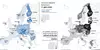
The following cartogram, created by Reddit user TeaDranks, has done just that, and it could change your entire perception of the world. Cartograms scale a region’s geographic space according to a particular attribute and in this case each square now represents 500,000 people. Cliquez sur la carte pour la grossir.

Source: TeaDranks/Vox
We all know that India and China have large populations, but this map emphasises their size on a global scale. Compared to conventional world maps, the two Asian powerhouses dominate. Along with several East Asian neighbours – Bangladesh, Japan, the Philippines and Indonesia – their contribution to the global population is clear.
The size of Nigeria and Brazil compared to the rest of Africa and Latin America is equally apparent.
The map also effectively highlights the contribution of cities and regions to total populations. For example, the greater Tokyo region accounts for a significant proportion of Japan’s overall population. Equally, Delhi, Shanghai and Mumbai all occupy areas larger than many European nations.
At the other end of the scale, some economies which are barely visible on traditional world maps appear much larger on the cartogram. Consider the cases of Hong Kong and Taiwan, whose relatively large populations compared to their geographical sizes see them feature much more prominently.
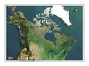
Conversely, some countries which are very large on conventional maps can barely be seen. Canada, Russia and Australia are much smaller in TeaDranks’ representation, which was inspired by Paul Breding’s 2005 work. Canada in particular disappears almost entirely.


Laissez un commentaire Votre adresse courriel ne sera pas publiée.
Veuillez vous connecter afin de laisser un commentaire.
Aucun commentaire trouvé